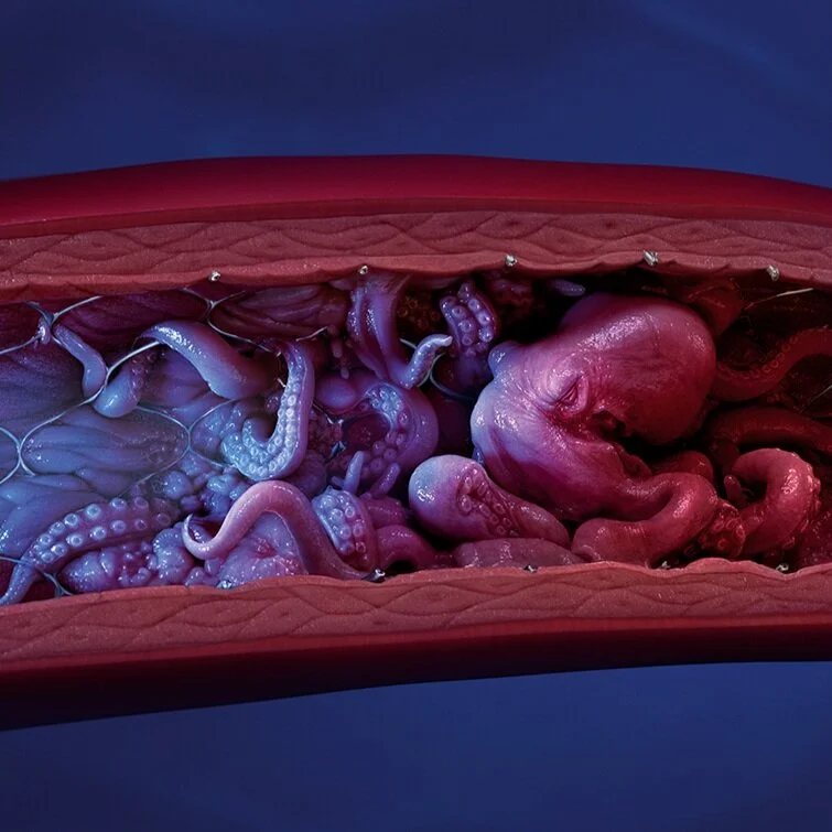
SAY GOODBYE
SAY GOODBYE
The situation: Peripheral atherectomies are complicated procedures, and doctors never really know what they’re going to encounter when they go in. To prepare for any eventuality, they’re forced to keep a suite of devices on hand, ramping up cost, complexity, and stress levels. Our client—Angiodynamics—had developed a game-changing device, a single tool with the features to handle whatever complexities arise in-vessel.
The insight: The space is saturated with devices all fit for different purposes, but one thing unites them—they all look, feel, and advertise themselves like power tools. We quickly realized that because we were a single tool that can handle anything, we beat them on technology. If we stood out and made a clear, compelling case, we’d win the market.
The solution: As the old saying goes, when others zig, zag. Rather than follow the crowd with our name and campaign, we broke the mold. Instead of a portmanteau of tech words and glamour shots of the device, we developed a brand and campaign that focused on a promise to doctors: no matter what you encounter, this device is the one tool you need.
AWARDS
2021 ADS OF THE WORLD FEATURE - Nov 17
2021 MANNY AWARDS - Best Medical Device
2021 MANNY AWARDS - Nominated for Best HCP Print Campaign and Best HCP Web Campaign
2021 PM360 TRAILBLAZER AWARDS - Best Professional Campaign - GOLD
2021 WEBBY AWARDS - Best Home Page Honoree
2021 B2 AWARDS - Best Integrating Marketing Campaign - GOLD
2021 B2 AWARDS - Corporate or Brand Website - GOLD
2021 B2 AWARDS - Product Launch or Relaunch - GOLD
2021 B2 AWARDS - Print Advertising - GOLD
2021 B2 AWARDS - Lead Generation: Small to Midsize Business - BRONZE
2021 APEX AWARDS - Devices - GOLD
CREDITS
Illusion CGI Studio - https://www.illusion.co.th/auryon
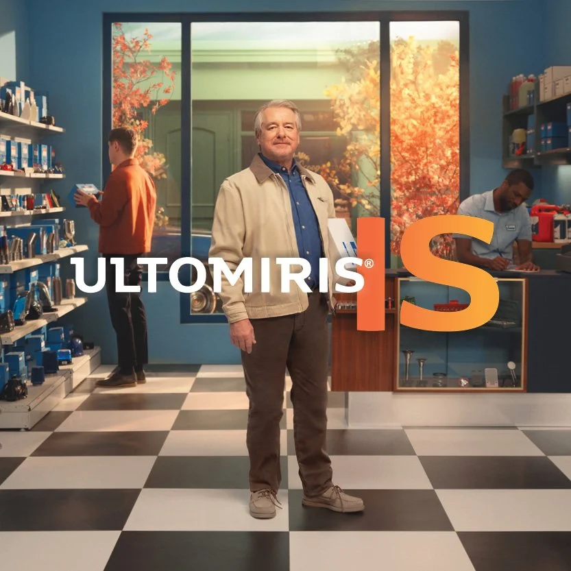
ULTOMIRIS IS TV - 2025
After the success of the 2024 commercials, the client set out to develop a new pair of spots for 2025 (still grounded in the inherited “ULTOMIRIS IS” campaign). We saw this as an opportunity to build on the seasonal time-passage device from the previous year and make the new work even more distinct and ownable.
Enter Craig and Rachel, our two new heroes who move effortlessly through time and space, once again illustrating the continuous control ULTOMIRIS brings to patients’ lives. As they transition from one environment to the next—seasons shifting behind them—we see what matters most (family, hobbies, work), and how ULTOMIRIS empowers them to move confidently through their world.
Both spots were filmed during an intense 10-day production in Prague, built around a highly complex set that enabled 5 full days of simultaneous video and photo capture across adjacent stages. The coordination alone was remarkable.
The final result: two tailored commercials for our primary demographics, strengthened national awareness of gMG, a continued spotlight on ULTOMIRIS, and a stunning suite of photography to extend the campaign’s look and feel across materials.
And the client? Thrilled—and already planning to do it all again in 2026.
CREDITS
Commercial directors – The Queen // https://thequeenfilms.com/
Photographer - Justin Bettman // https://www.justinbettman.com/
PRODUCTS WITH PURPOSE
PRODUCTS WITH PURPOSE
The situation: The nutritional product market is a sea of sameness. DSM—a global partner and supplier of ingredients for human nutrition and health companies—needed a way to differentiate themselves from a host of competitors with many of the same offerings.
The insight: When you can’t differentiate based on product, you can do it through your vision and values. We created a campaign that sought to build relationships with customers based on something far more powerful than the products DSM sells: their viewpoint on how those products impact the world at large.
The solution: The “Products with Purpose” campaign paid off that vision and value story. We created a campaign that inherently differentiated DSM by going beyond the products they sell, delivering a human benefit story. In doing so, we simultaneously grouped the competition together while creating a promise based on a larger, more important vision. Rather than the “what,” we focused on the “why.”
Ownable visuals: We created visuals that were uplifting and unmistakably DSM, while still allowing for specificity across the multitude of business units in the portfolio. This elevated DSM to a category on its own, far above the typical stock library used by the competition.
The “Products with Purpose” campaign shows how DSM sees the individual impact of every human nutrition and health product in a distinct and engaging way. On one side there is a common health and nutrition product that the competition sees. On the opposite side, we reveal the true purpose of that product and the impact it has on the end user. By drawing attention to purpose, it demonstrates DSM’s unique understanding of the humanity of the end consumer and the real-life benefits that nutritional products may have on the health and well-being of people worldwide.
AWARDS
2021 ADS OF THE WORLD FEATURE - Nov 17
2021 SHORTY AWARDS - Best Graphics
2021 B2 AWARDS - Brand Purpose - Silver
2021 APEX AWARDS - Metabolic - Gold
2021 WEBBY AWARDS - Integrated Campaign Honoree
CREDITS
Illusion CGI Studio
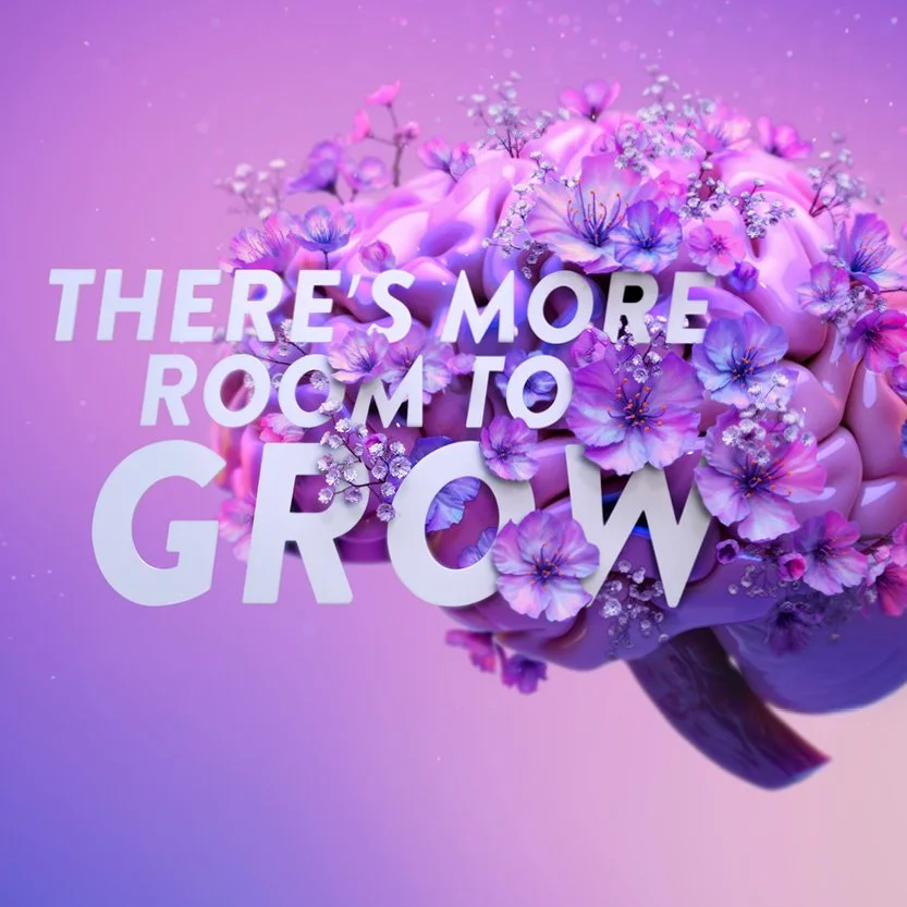
ROOM TO GROW
HCPs treating Dravet syndrome and Lennox-Gastaut syndrome often hesitate to add a new therapy, fearing any change might disrupt the fragile balance they’ve worked hard to achieve. Seizure management in these patients is so precarious, and the journey so arduous, that clinicians can become more focused on avoiding setbacks than pursuing further improvement. Our team set out to shift that mindset.
We created a campaign that reassures HCPs they can further reduce seizures without added complications—ultimately enabling brighter outcomes for their patients. This elegantly unexpected concept debuted on a ghost page designed to spark curiosity, offering a concise brand story that drives HCPs to the full branded site for a deeper, more immersive experience.
In a category where every brand relies on the same real-patient narratives, we needed to rise above the sea of sameness. Our campaign introduced a fresh, beautifully blooming brain visual—an unexpected symbol of possibility in a space that often feels overwhelmingly dark.
Originally conceived as a small, standalone initiative—a ghost page supported by social placements and targeted emails—the work quickly resonated with the clients. They saw the potential and chose to expand it. The campaign is now evolving to replace the existing HCP platform, giving the brand more room to grow and majorly expanding the scope.
See it live in action: https://www.finteplahcp.com/moreroomtogrow
Currently up for MM+M Best HCP Website
CREDITS
Lightfarm Studios - https://www.lightfarm.com/home
Share
ULTOMIRIS IS TV - 2024
The Problem: People feel limited by the unpredictability of generalized myasthenia gravis (gMG). The symptomatic ups and downs of existing treatments can be incredibly disruptive.
gMG is a rare disease, so many patients struggle to get the validation, recognition, and care they deserve.
70% of patients were not satisfied or only somewhat satisfied with their current gMG treatment plans.
The Approach: These hard-to-reach patients needed to know about the continuous symptom control and the freedom of just 6-7 infusions per year that ULTOMIRIS offers.
So we turned our consistent dosing requirement into an ownable proposition–and put it on TV.
Two spots invite people with gMG to think about their lives—and their condition—differently. This moment of national representation helped them find their voices to finally demand a treatment that works for them.
The Work: Leveraging the inherited “ULTOMIRIS IS” campaign, the creative translated the promise of long-term predictability into an ownable visual technique that feels both confident and unmistakable.
It showed that nothing can hold those with gMG back as they go through their day with effortless swagger.
Each spot focuses on 1 character: Rikki or Jack. We follow them through thoughtfully choreographed sequences that move smoothly from one season to the next—without ever breaking their stride—with continuous symptom control.
CREDITS
Director: Ben Tricklebank // https://bentricklebank.com/
Photographer: John Blaize // https://www.johnblais.com/
CGI: Fuse // https://www.fuseanimation.com/
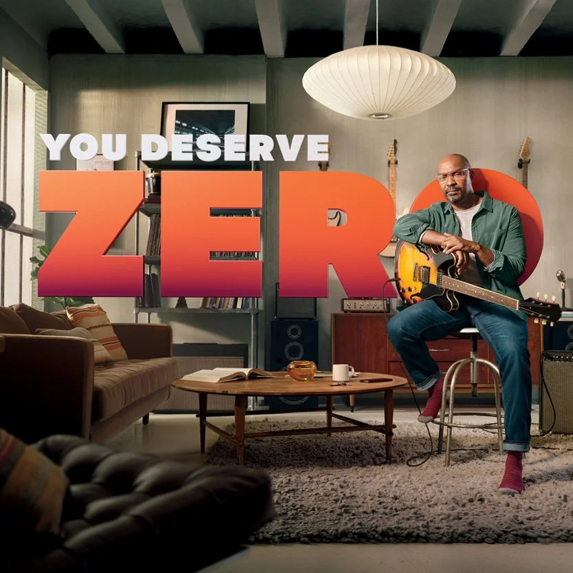
YOU DESERVE ZERO
The Problem: Neuromyelitis optica spectrum disorder (NMOSD) is an extremely rare, chronic autoimmune disease that affects the central nervous system. It causes unpredictable relapses that can leave patients with life-changing disability, including blindness, paralysis, and even premature death.
Many with NMOSD must become their own advocates, researching the disease and treatment options themselves. With fewer than 15,000 Americans living with this condition, doctors are slow to recognize NMOSD. HCPs lack familiarity with treating this disease, leaving patients vulnerable as they continue to relapse while receiving other treatments.
The Strategic Approach: ULTOMIRIS is the ONLY treatment where patients had ZERO relapses in clinical trials.
We decided to raise people’s treatment expectations and encourage them to advocate for a relapse-free life with ULTOMIRIS.
It was time for people living with NMOSD to demand ULTOMIRIS and envision life with:
ZERO tradeoffs. ZERO compromises. ZERO relapses.
The Work: “YOU DESERVE ZERO” is a monumental declaration that empowers people living with NMOSD to see a life free from the fear of relapse.
What does it look like when people stop settling for less and advocate for more?
We show people living with NMOSD in moments of confidence in environments that serve as lush extensions of their personalities–backed by the power of ZERO. They are living life and exploring their passions on their own terms with ULTOMIRIS.
“YOU DESERVE ZERO” encourages people to speak up for themselves and to take hold of what only ULTOMIRIS can offer: ZERO relapses.
Director: Ben Tricklebank // https://bentricklebank.com/
Photographer: Gary Salter // https://www.garysalter.com/
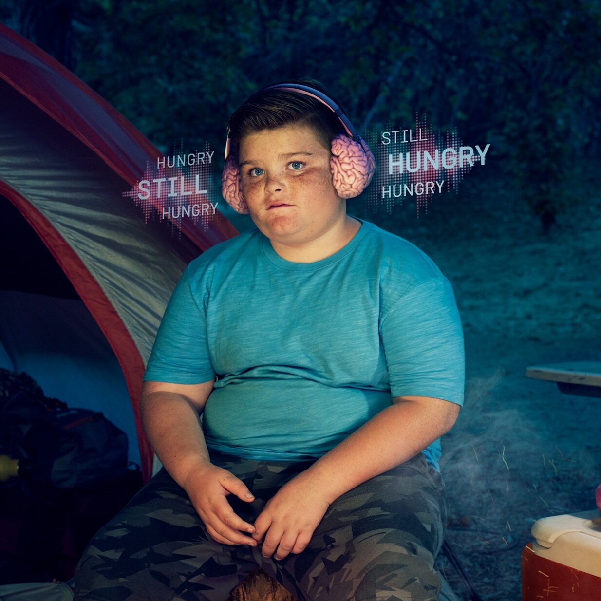
ALL I HEAR IS HUNGER
HUNGER. Some people’s brains make it hard to focus on anything else.
Rare genetic variants can result in dysfunctional regulation of hunger, causing patients to be insatiably hungry and leading to early-onset, severe obesity.
THE SITUATION
Sometimes, obesity has a very unusual cause. Very rarly, a mutation in the MC4R pathway affects the brain’s ability to signal the body when it has had enough to eat.
People living with this mutation live with constant, unrelenting hunger, which naturally leads to extreme obesity.
This condition is exceedingly rare–there may be only a couple hundred cases in the world. Not only were most people not aware of it, even doctors almost never consider a genetic cause when treating patients for obesity.
Our clients had a product designed to help and needed a campaign to shape the market.
We knew our idea would have to work extra hard because we had to:
* Raise awareness of this genetic cause for obesity among physicians
* Raise awareness among potential patients and caregivers
* Help make people aware of who may be affected
THE INSIGHT
We learned that there are some people living with obesity who simply can’t lose weight no matter how hard they try. And that no matter how loyally they stick to diets and exercise, if they don’t lose weight, no one believes they actually did what they were supposed to do.
And we learned that deep down they just know something about them is different.
THE SOLUTION
We built the “All I Hear Is Hunger” campaign. We knew it had to hit home with people to help patients self-identify and put genetic causes for obesity top of mind for physicians.
The campaign used a very visually arresting image to get attention. The “brainphones” we created gave life to the feeling these people live with every day and did it in a way that was understandable for those who don’t live with this feeling.
CREDITS
HCP photographer - Erik Almas
DTC photographer) - Jim Hughes
CGI Studio - Alice Blue
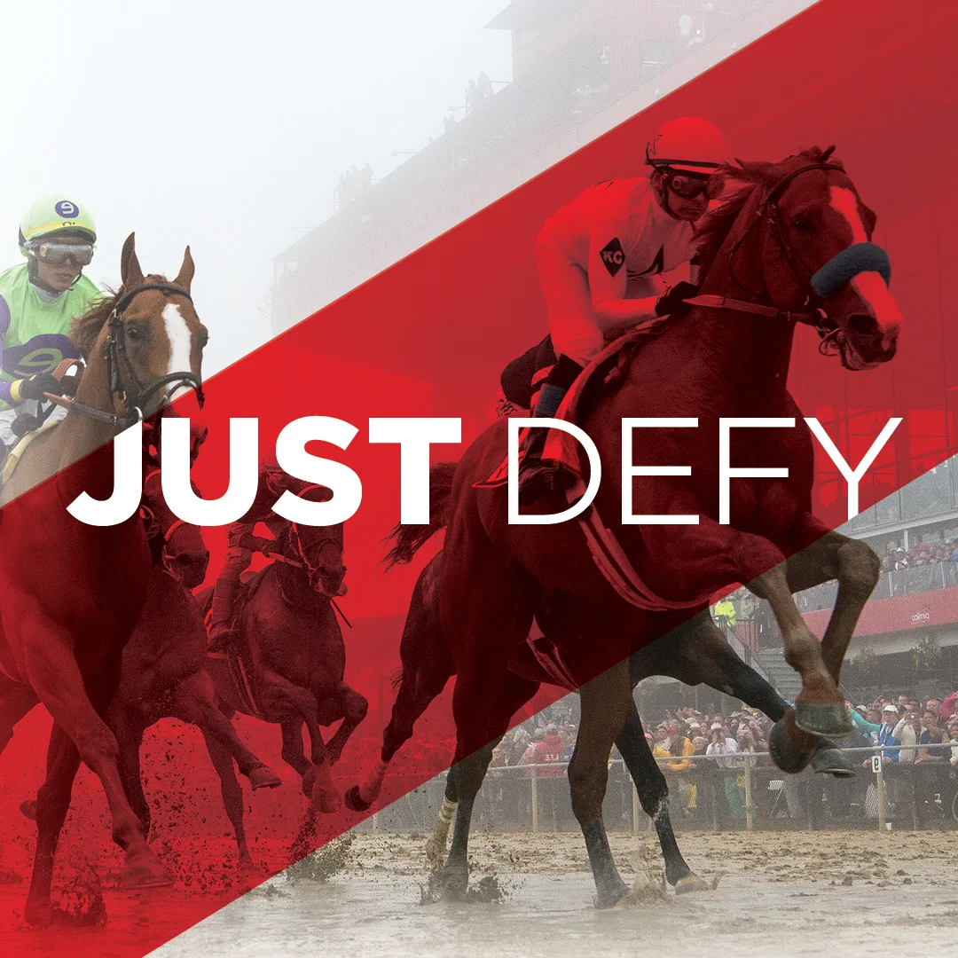
#JUSTDEFY
13 Triple Crown winners have made a run at Travers. Only 1 succeeded. Clearly, the odds are stacked against these giants of racing. Should that deter Justify from trying? Absolutely not. To make history, he has to #JUSTDEFY the naysayers, the past failures, and everything else that makes a Quadruple Crown the impossible dream.
The idea: Challenge Justify’s owners, trainers, and jockey to defy history by showing all the reasons not to run. For true champions, those reasons are fuel.
What we created for them:
#JUSTDEFY Hash Tag
JUST DEFY Campaign
Hype Video
Microsite (housed video, social media feed and petition)
Social Media Content for Instagram, Facebook and Twitter
Poster Series
Flyers
Get Well Card (sent to owners and trainer when Justify was injured)
Banner for #JUSTDEFY Launch Party
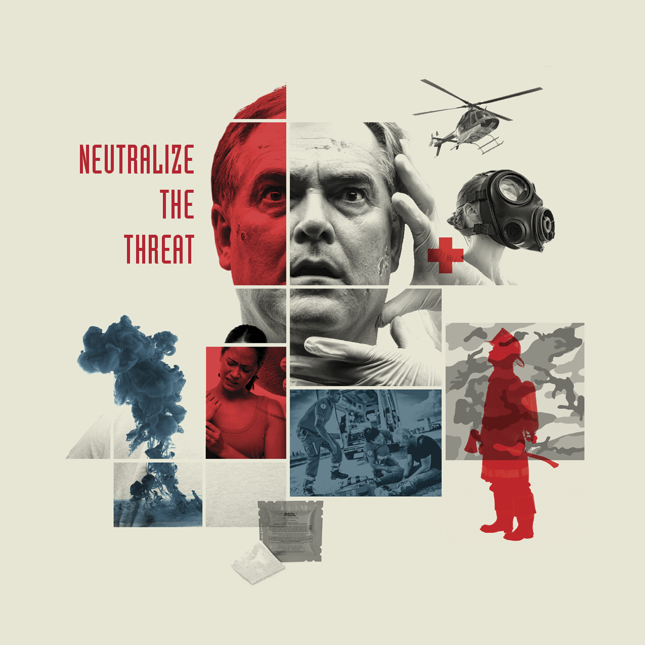
EMERGENT
Emergent BioSolutions develops, manufactures, and delivers a portfolio of medical countermeasures for biological and chemical threats, as well as emerging infectious diseases.
Initially, Emergent came to Fingerpaint looking to rebrand a product called RSDL, Reactive Skin Decontamination Lotion Kit, meant for first responders (police, fire, EMS, military) to use on victims exposed to chemical warfare agents. The new design had to appeal to all segments of the first response team. Conceptually, red and blue accents were chosen to give an effect of flashing emergency lights, and a chaotic montage of stark black-and-white imagery to nod to the seriousness of the event.
The client loved the approach but wanted to make the product feel a little more accessible. Instead of black-and-white imagery, we used desaturated color photography and shifted the blue to an army green to match the product packaging.
The next task was to brand a pair of therapeutic treatments for pre- and postexposure protection from anthrax disease and inhalation anthrax postexposure (BioThrax and Anthrasil) into one piece. BioThrax is the only FDA-licensed vaccine for the prevention of anthrax disease, and Anthrasil is a sterile solution for infusion indicated for the treatment of inhalational anthrax. The two products can be used in combination.
To franchise our new look and feel from RSDL, we applied the same chaotic photo montage treatment to the anthrax products using purple (the color of anthrax under microscopes) and gold as an accent color. The audience for these products was biological threat response team personnel and members of government.
TURN THE CONVERSATION
Before the opioid crisis fully took hold, Mallinckrodt was aiming to launch a pair of abuse-deterrent acute pain products, XARTEMIS XR and TAURGO XR.
We were tasked to create a prelaunch campaign that brought awareness to the growing problem while informing prescribers of the risks of their habitual prescribing patterns (as well as elevating the unmet need(s) in the acute pain space).
In response, we came up with an ambigram (a word, art form, or other symbolic representation whose elements retain meaning when viewed or interpreted from a different direction, perspective, or orientation). Ours reads “relief” when viewed right side up, but from another perspective we see “abuse” is directly tied to the benefit (no matter how much we want to ignore the problem). The client said it gave them “chills”. We ended up titling the campaign, Turn the Conversation.
Using journal ads, animated banner ads, email campaigns, and direct mailers, we drove viewers to a landing page with statistics and KOL videos about the issue. We even created a conference booth with a spinning ambigram to grab attendees’ attention, hoping to get them “hooked” on the idea of an abuse-deterrent option.
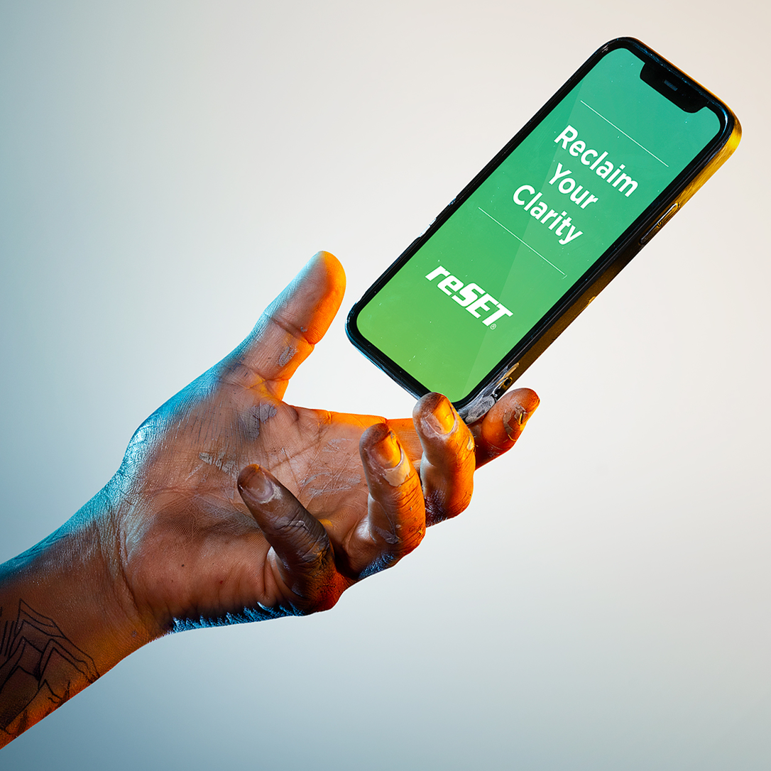
REACH FOR reSET
Addiction can take you to a dark and confusing place, but when the way forward isn’t clear, Reach for reSET/reSET-O.
reSET or reSET-O can help treat substance use disorder (SUD) and opioid use disorder (OUD) with 24/7 support on your phone.
CREDITS
Photographer - Tim Tadder // https://www.timtadder.com/
LOGOS
What makes a good logo? It is memorable, unique, and simple. An effective logo is timeless. You want it to still make a statement 50 years from its creation. A versatile logo can be switched to another color and still be effective. An appropriate logo follows the theme of the company it represents. The process usually includes brainstorming, sketching, feedback, and finishing touches.
I have created logos for B2B, B2C, financial companies, pharmaceutical companies, bar/restaurants, clothing brands, and bands; personal brand marks for individuals; and more.